
There’s a thread on the Fountain Pen Network that is titled What is the most beautiful pen ever designed in your eyes ? That thread, as I posted my reply, got me to thinking about beauty and pens, and what makes a pen beautiful. Here are two pens.
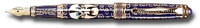
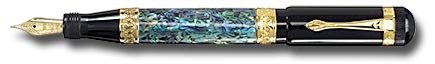
Are these pens beautiful? The upper one has an intarsia finish, while the lower one is girdled with a mosaic of abalone shell. Neither was inexpensive. They’re both pretty to look at, but is beauty skin deep? For these two pens, it might well be. They were both sent to me because they were just plain crappy writers. The upper one has a cheap injection-molded feed made of a hydrophobic material that’s been coated with something to make it pretend it doesn’t repel water (and, hence, ink). The lower one likewise has a feed that’s hydrophobic even though its design is otherwise better. Both have metallurgically soft (“bend once”) nibs that were misaligned until I adjusted them — and will probably become misaligned again through use. So I ask again: are these pens beautiful?
Here are two more pens. Are these pens beautiful?
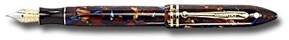
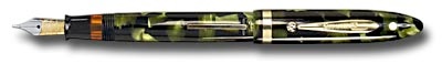
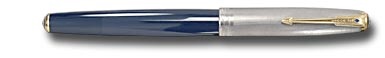
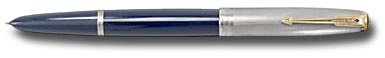
The upper pen above is a Sheaffer Balance II, a nostalgic piece whose good looks rely on the revolutionary styling of a pen that was introduced nearly 70 years earlier than its 1998 release date. The lower pen is a Sheaffer Balance, the pen on which the Balance II was based. (Note, if you will, that they didn’t quite get it right on the rebound; look at the difference in section shapes.) The Balance II was expensive, made of a material that Sheaffer engineers knew to be crack-prone, and fitted with an ink delivery system that includes a bend-once nib and isn’t always trustworthy. The original Balance, on the other hand, while it was also relatively expensive in its time, was beautifully made of the best available material, fitted with a stiff Waverley nib, and reliable. Today, either of these pens can be bought for about the same price.
Here are two more pens. I think these two pens are beautiful.
For functional beauty that happens also to look pretty doggone nice, my ideal is this pen:
For pure aesthetic gorgeositudinousness that also happens to write remarkably well, it's this one:


Note that neither of these pens is a nostalgic recreation that cannot but ride on the back of something that once was, and neither is tarted up with any kind of blingified marketspeak surface treatment ("raw ebonite," enamel, lacquer, etc.). And neither is a body stuck on a chassis that employs 100% bought-in components (nib, feed, converter) and is therefore entirely identical to bazillions of other pens' chassis. These are both originals, and they are elegant in and of themselves. As with every other thing that we see as beautiful, if the pen isn't innately beautiful, no amount of plastered-on paint or chrome will hide its deficiencies.
In recognition of these pens’ extraordinary beauty, I hereby award them the Majesty Cup (created this very day because it’s Sunday and I’m therefore at liberty to play).

So, umm, am I saying here that any pen that’s not half a century old, and different from the other pens around it, isn’t beautiful? Not at all. There are some stunningly beautiful modern pens, pens that may or may not be built on that stock chassis to which the previous paragraph refers in a slightly slighting manner. They’re beautiful because they’ve been designed and built with care for their handling and writing performance, not just for their ability to pop eyes.

Just remember, beauty is in the eye of the beholder.
I’ve had my say. I invite your comments.


